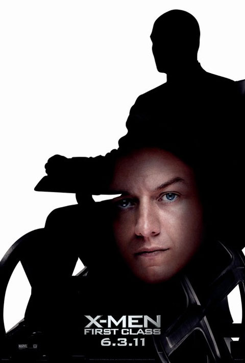
Layout:
The layout of this movie poster is the main thing that needs to be revised. The first thing of the layout that needs to be revised is the placement of the actor’s blown up face. Because it is placed awkwardly in the center, it is distracting for viewers to understand the concept and point of the poster. If the face had to stay on the poster, I would move it somewhere less awkward, for example the upper left corner. Also, the movie title and its release date are in a significantly small font size. To grasp viewers’ attention, the font should be in a much larger font and a bright color such as red to make it stand out.
Images:
The images of this poster needs serious revision. By putting the large face image of the movie’s actor in the middle, the movie poster unintentionally sets a comical tone than a serious one. Rather than fix the unnecessary floating face, I would simply cut it out entirely from the poster. The black silhouette in the background adds enough intrigue and seriousness alone.
